Most travellers expect a hotel to be a box-shaped building with a sign hanging outside – but the themed entertainment industry does things differently.
Guests of themed hotels find themselves sleeping in surroundings designed to look like Roman palaces, giant hunting lodges or foreign seaside towns. Pulling it off takes much more than just copying the source material.
Competition has never been higher in the hotel industry. First the internet then low-cost transport broadened travellers’ horizons and increased competition on accommodation pricing. Next the economic downturn put the brakes on many extended vacations. It is now tougher than ever to lure travellers so resorts in particular are looking to stand out from the crowd.
Three hotels in Orlando’s Universal Studios park complex are at the forefront of this trend as they aren’t just themed, they are based on architecture styles from all over the world. It means that they have to stand up to comparison with the real thing as well as operating as a full-service hotel which is a challenge in itself. Universal does it so well that the hotel and its theme become one.
A taste of Italy…in Orlando
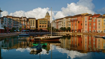
The grandest of the bunch is the Loews Portofino Bay Hotel. From the moment guests drive down the winding cypress tree-lined road to the hotel they are immersed in an experience that tries to convince them they are in Italy. Old Italian posters adorn the exposed brickwork in the lobby, Vivaldi is pumped in through hidden speakers and padded tapestries line the inside of the elevators. Corridors are even mocked up as city streets with faux star scenes on the tall ceilings and porcelain plaques, which would usually have a house name etched into them, showing the room numbers.

Harbour at the hotel, designed to replicate Portofino in Italy
A series of Continental-style multi-coloured road signs direct guests to the heart of the hotel - a harbour lined with Vespas, olive trees and cafés. A string quartet is even on hand to serenade guests from a balcony in the evening. Souvenir shops housed in fishing huts and cream-coloured apartments with cracked plaster walls surround the water’s edge. They are actually rooms, but it’s hard to tell as the exteriors are decorated so ornately.
“The façades of the buildings are one of the most unique features of the property,” says Russ Dagon, vice president of Universal Creative. “Modelled after the real city of Portofino, the relatively simple façades are hand-painted by skilled artists using a technique known as trompe-l’oeil to create the illusion of detail that is simply not there. Shadowed brickwork and detailed awnings give the buildings a look that from a distance truly deceives the eye.”
The attention to detail is infectious and you find yourself reaching to tap antiques to check if they are genuine
Nevertheless, there’s nothing make-believe about the Portofino’s facilities which include a full-service spa, nine restaurants and lounges, and three pools with one suitably styled as a ruined Roman aqueduct. The Italian theme pervades throughout the hotel’s 795 rooms and suites as the beds have huge padded mattresses, lace sheets and sculptured wooden headboards.
Italian paintings hang on the walls and there are only a few give-aways. There’s the plastic phone and bedside alarm, which look out of place in such regal surroundings. The lack of rubbish on the streets around the harbour is another tell-tale sign that this isn’t the real Italy – it’s better.
Attention to detail
The attention to detail is infectious and you find yourself reaching to tap antiques to check if they are genuine. They are. Mr Dagon says: “The theming is everywhere, from custom light fixtures using Italian glass, to hand-painted tapestries and hand-painted tile door plaques. The sight lines were very important to the team that worked on the design of the property to ensure that our guests would be fully immersed in their Italian experience at every turn.”
It even extends beyond what the guests can see. The back-office areas of most hotels are decorated very plainly, but not the Portofino. This is where the staff slip into character and the decor plays a part in that.
“Loews Portofino Bay Hotel is themed in our back-of-the-house areas as we want to infuse the Italian theme into all aspects of the guest and team-member experience,” says managing director Diane Petit. “Our team-member cafeteria is called ‘Ciao’ and our training for new team members includes Italian language, history and customs. Our team members embrace the theme and to assist them we give them a passaporto, which contains popular Italian service phrases they can use during guest interactions.”
The idea for the hotel, which opened in 1999, came from movie producer Steven Spielberg who was a consultant on Universal’s Islands of Adventure park in Orlando. One of his favourite hotels is the historic Splendido in Italy’s Portofino, but he went one step further than suggesting a recreation of the building – his proposal was for a mock-up of the entire village.

Balcony looking out on to the harbour
The task was given to architects, Wimberly Allison Tong & Goo (WATG), a renowned firm behind design at Atlantis hotel resorts, Caesars Palace in Las Vegas, The Palace of the Lost City in South Africa’s Sun City, as well as numerous Mandarin Oriental, Ritz-Carlton, Four Seasons and Fairmont properties worldwide.
“In some cases we have been asked to develop the brief from scratch with little more than a room count. The briefs may or may not include design direction, in which case we have been asked to initiate the vision,” says Michael Chun, WATG’s senior vice president. The source material used by the company can be very diverse.
“With properties like Caesars Palace in Las Vegas there was already an existing Roman vocabulary to draw from,” says Thomas Fo, fellow WATG senior vice president. “When we designed the Venetian hotel in Las Vegas we spent a week in Venice with the owner and his staff, walking the streets and the piazzas, sketching, and taking lots of photographs and video. We talked to not only the locals of Venice, but the tourists. We were looking for what made Venice special and different from other cities, what people liked, and where they gathered, ate and relaxed. There was no substitute for what we learnt in that week.”
From concept to reality
The design process follows key criteria and has clear stages. “The first thing we like to do is establish the main storyline,” says Mr Fo. “It is something that you can always go back to, to see if your design is visually making sense. We do a lot of research on whatever theme we are doing. We gather a lot of images from books, videos and articles, and if possible visit buildings of the same theme. As we start to develop the design we do a number of design sketches to see how the theme and the massing of the building can integrate into the programme of the hotel.
The theming of our hotel, from the harbour piazza to the food, music and ambience, helps us make lifelong memories
“The length of concept and schematic design phase vary. It could be as short as a couple of months or an evolving creative design process that could be six to eight months depending on the size of the project and the complexity of the theme.”
Mr Chun explains that WATG also produces an art package for all themed hotels it works on. “This art package is the further conceptualisation of the themed details such as, with Atlantis, the sea life, shells, fish, animals as well as other potentially fictional elements which transcend reality into fantasy. Not all Atlantis’ themed elements are ‘of this Earth’ which adds an additional element of surprise and delight to the guest.” This is the ultimate aim for all themed hotels.
“We believe travel is all about creating memories,” Ms Petit concludes. “The theming of our hotel, from the harbour piazza to the food, music and ambience, helps us make lifelong memories for our guests. We know that our guests arrive expecting a stay that is truly unique and memorable, and our team consistently delivers on that commitment. Our goal is for your vacation experience to begin the moment you walk into our hotel and get a taste of ‘la dolce vita’ – the sweet life.”
A taste of Italy…in Orlando

Attention to detail

